
유진정의 기록
[Dacon] 고객 대출등급 분류 AI 해커톤 _ 우수코드리뷰(2. RandomForest, GradientBoosting, voting) 본문
[Dacon] 고객 대출등급 분류 AI 해커톤 _ 우수코드리뷰(2. RandomForest, GradientBoosting, voting)
알파카유진정 2024. 3. 2. 12:54from scipy import stats
z_scores = stats.zscore(train[numcols].drop(['총연체금액','연체계좌수'], axis = 1))
outlier_ratio = {}
threshold_to_try = {}
for threshold in np.linspace(3,10,71):
outliers_z = train.drop(['총연체금액','연체계좌수'],axis=1)[(z_scores > threshold).any(axis=1)]
train_drop_outlier = train.copy()[(z_scores < threshold).all(axis=1)]
outlier_ratio[threshold] = round(len(outliers_z)/len(train) * 100,4)
threshold_to_try[threshold] = train_drop_outlier
outlier_ratiotrain.head()
train.info()2등 하신분이에요
1. 총상환이자와 총상환원금 중심 설계
EDA에서, 총상환이자와 총상환원금이 예측에 매우 중요하다는 사실이 포착되었습니다. 이 데이터의 특성을 잘 이용하고자 로그변환을 하였고, 자연스럽게 원금과 이자가 0의 값을 가지느냐 아니냐에 따라 데이터를 분리하여 분석을 달리 하였습니다.

2. 원금 이자 결측치 처리
원금이나 이자가 0인 데이터를 결측치로 간주하고, 다른 변수들로 예측하여 값을 추정하여 사용했습니다.

3.  모델 선택
모델링 시, 모델 후보로는 RandomForest, LGBM, XGB, KNN, GradientBoosting, ExtraTrees로 두었고, 이 안에서 간단한 학습 후, 검증결과가 좋은 모델은 선택했습니다.

4. 모델 성능 향상
- 피쳐선택은 RFECV함수도 사용하였고, 그 후 피쳐를 하나씩 추가해서 검증점수가 향상되었는 지를 체크하는 방식으로 피쳐를 줄이고 늘렸습니다.
- GridSearchCV함수를 사용하여 하이퍼 파라미터 튜닝을 하였습니다.
- 이 과정을 반복실행하며, 세세하게 성능향상이 이루어질 수 있도록 신경썼습니다.

5. 예측 타겟 축소
이자나 원금이 0인 데이터에 대해서는, 모델이 그 복잡한 패턴을 파악하는 것이 어렵다고 판단되었습니다.
 따라서, 이 데이터에 대해서는 모델이 예측 및 학습하는 타겟을 줄이고, 빈도수가 높은 타겟 위주로 학습하며 성능을 높였습니다.

6. 소프트 보팅
모델의 안정성을 더하기 위해 최종 모델에 소프트 보팅 알고리즘을 적용시켰습니다. 그 결과 실제 퍼블릭 스코어는 덜했지만, 프라이빗 스코어는 더 높은 점수를 얻을 수 있었습니다.
[[ 개념 복습 ]]
피쳐 데이터의 속성 또는 변수
RFECV 함수 (Recursive Feature Elimination with Cross-Validation의 약어) 교차 검증을 통해 피쳐를 순차적으로 제거하면서 모델의 성능을 평가하고 최적의 피쳐를 선택
하이퍼 파라미터(모델 학습 과정 중에 사람이 직접 설정해야 하는 매개변수)조정 모델의 성능을 향상시키기 위해 모델에 영향을 주는 파라미터를 조정하는 과정 ( 학습률, 은닉층의 수, 은닉층의 노드 수, 규제 파라미터 )
GridSearchCV (그리드 서치 교차 검증(Grid Search Cross-Validation)의 약어) 여러 하이퍼 파라미터 후보들을 조합하여 최적의 하이퍼 파라미터를 찾는 데 사용
소프트 보팅 어러 모델의 예측 결과를 확률로 변환하여 평균을 내거나 다수결을 통해 최종 예측을 수행하는 앙상블 방법
import pandas as pd
import numpy as np
import seaborn as sns
import matplotlib
import matplotlib.pyplot as plt
matplotlib.rcParams['font.family'] = 'Malgun Gothic'
matplotlib.rcParams['font.size'] = 15
matplotlib.rcParams['axes.unicode_minus'] = False
import warnings
warnings.filterwarnings("ignore")

from sklearn.ensemble import RandomForestClassifier
from sklearn.model_selection import cross_val_score, cross_validate, KFold, StratifiedKFold
from sklearn.feature_selection import RFECV
from sklearn.model_selection import GridSearchCV
from sklearn.ensemble import GradientBoostingClassifier
from sklearn.model_selection import train_test_split
from sklearn.metrics import f1_score
from sklearn.preprocessing import StandardScaler
train = pd.read_csv('train.csv')
test = pd.read_csv('test.csv')
submission = pd.read_csv('sample_submission.csv')
cols = train.columns
numcols = train._get_numeric_data().columns
target = '대출등급'
catcols = list(set(cols)-set(numcols))
catcols.remove(target)
display(numcols, catcols)
baseline코드에선 인코더를 직접 썼는데 이건 다르죵
numcols에는 숫자형 열의 이름이, catcols에는 범주형 열의 이름이 포함됩니다.
중복되는 데이터를 지구 타겟 분포 확인 후 모델 구축해볼게용~!
display([train[column].unique() for column in catcols])

# 의미가 겹치는 범주 처리
train['근로기간'].replace({'3':'3 years', '<1 year':'< 1 year', '1 years':'1 year', '10+years':'10+ years'}, inplace=True)# 데이터 중복 확인
print(train.duplicated(keep='first').sum())
# 테스트셋에도 적용
test['근로기간'].replace({'3':'3 years', '<1 year':'< 1 year', '1 years':'1 year', '10+years':'10+ years'}, inplace=True)
order_grade = ['A','B','C','D','E','F','G']
sns.countplot(x=target, data = train, hue = target, order=order_grade)
plt.show()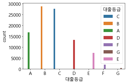
실수형 데이터를 먼저 시각화해봅시당
Violin Plot 바이올린 모양으로분포가 드러나게함~! Box plot보다 직관적
plt.figure(figsize=(12,12))
for idx, feature in enumerate(numcols):
    plt.subplot(3,3,idx+1)
    sns.violinplot(y=numcols[idx], hue = target, data = train, hue_order= order_grade)
    plt.legend(loc='center left', bbox_to_anchor=(1, 0.5), fontsize=11)
plt.tight_layout()
plt.show()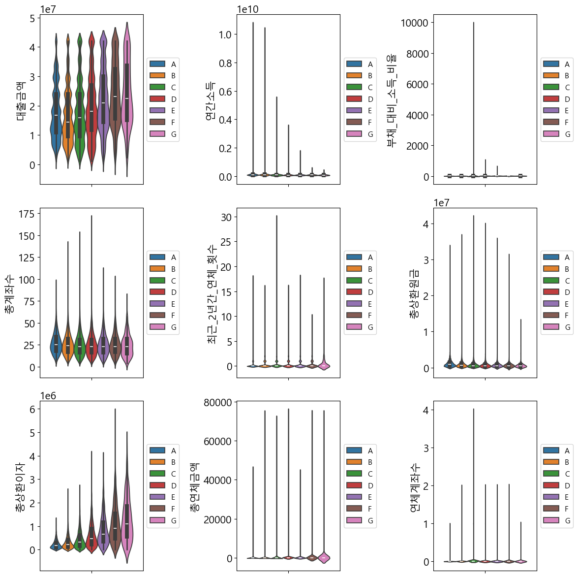
plt.figure(figsize=(12,12))
for idx, feature in enumerate(numcols):
    plt.subplot(3,3,idx+1)
    sns.histplot(x=numcols[idx], data = train, kde=True)
plt.tight_layout()
plt.show()
order_years = ['< 1 year','1 year', '2 years', '3 years', '4 years', '5 years', '6 years',
               '7 years', '8 years', '9 years', '10+ years', 'Unknown']

plt.figure(figsize=(12,12))
plt.subplot(2,2,1)
sns.countplot(x =catcols[0], hue= target, data =train, hue_order= order_grade)
plt.gca().set_xticklabels(plt.gca().get_xticklabels(),fontsize=10, rotation = 45)

plt.subplot(2,2,2)
sns.countplot(x =catcols[1], hue= target, data =train,order = order_years,hue_order= order_grade)
plt.gca().set_xticklabels(plt.gca().get_xticklabels(),fontsize=10, rotation = 45)

plt.subplot(2,2,3)
sns.countplot(x =catcols[2], hue= target, data =train, hue_order= order_grade)
plt.gca().set_xticklabels(plt.gca().get_xticklabels(),fontsize=10, rotation = 45)

plt.subplot(2,2,4)
sns.countplot(x =catcols[3], hue= target, data =train, hue_order= order_grade)
plt.gca().set_xticklabels(plt.gca().get_xticklabels(),fontsize=10, rotation = 45)

plt.tight_layout()
plt.show()
범주형 데이터를 먼저 시각화해봅시당
countplot을 그릴건데용 그냥 세는 겨
order_years = ['< 1 year','1 year', '2 years', '3 years', '4 years', '5 years', '6 years',
               '7 years', '8 years', '9 years', '10+ years', 'Unknown']

plt.figure(figsize=(12,12))
plt.subplot(2,2,1)
sns.countplot(x =catcols[0], hue= target, data =train, hue_order= order_grade)
plt.gca().set_xticklabels(plt.gca().get_xticklabels(),fontsize=10, rotation = 45)

plt.subplot(2,2,2)
sns.countplot(x =catcols[1], hue= target, data =train,order = order_years,hue_order= order_grade)
plt.gca().set_xticklabels(plt.gca().get_xticklabels(),fontsize=10, rotation = 45)

plt.subplot(2,2,3)
sns.countplot(x =catcols[2], hue= target, data =train, hue_order= order_grade)
plt.gca().set_xticklabels(plt.gca().get_xticklabels(),fontsize=10, rotation = 45)

plt.subplot(2,2,4)
sns.countplot(x =catcols[3], hue= target, data =train, hue_order= order_grade)
plt.gca().set_xticklabels(plt.gca().get_xticklabels(),fontsize=10, rotation = 45)

plt.tight_layout()
plt.show()
제가 한거랑 가장 비슷한 부분인데 히트매븡로 상대도수를 표현했어요~!
상대도수로 하면 합이 1이니까 그 수치의 범위가 다른 것들을 눈으로 보기에 좋아서 전 이거 많이 씁니다~!
plt.figure(figsize=(10,12))
for idx, feature in enumerate(catcols):
    plt.subplot(2,2,idx+1)
    pivot = train.pivot_table(
    index=feature, columns = target, aggfunc="size")
    pivot['sum'] = pivot.sum(axis=1)
    for column in pivot.columns:
        pivot[column] = pivot[column] / pivot['sum']
    pivot = pivot.drop('sum',axis=1).T
    sns.heatmap(pivot, cmap=sns.light_palette('Green',as_cmap=True), annot=False)
plt.tight_layout()
plt.show()
> `대출기간`과 `대출목적`은 그 범주에 따라 대출등급의 분포가 다른 것이 확인됩니다.
> 반면, `주택소유상태`와 `근로기간`은 범주에 따라 대출등급의 분포가 매우 유사한 것이 관찰됩니다.
> 또한, `대출목적`은 범주가 상대적으로 많고, 데이터가 적은 범주도 다수 존재합니다. 학습데이터에 그대로 사용 시 과적합의 위험도 경계할 필요가 있습니다.
이상치를 판단해야하는데요,
결측치는 삭제하면 그만이지만 이상치는 그 기준이랄게 필요하잖아요~
Z-score 기억하시나요? 정규분포를 배운 확률과 통계때부터 저희는 은은히 정규화를 해왔는데요~!
'개인공부 > Machine Learning' 카테고리의 다른 글
| [ 논문 ] Attention is All you need (0) | 2024.05.03 |
|---|---|
| [DB 1st] 데이터 분석가가 반드시 알아야할 모든 것_10장 데이터 탐색과 시각화 (0) | 2024.03.13 |
| [Dacon] 고객 대출등급 분류 AI 해커톤 _ 우수코드리뷰(2-1. 모델 설명과 개념들) (0) | 2024.03.02 |
| [Dacon] 고객 대출등급 분류 AI 해커톤 _ 우수코드리뷰(1.BASELINE) (0) | 2024.03.02 |
| [머신러닝] 앙상블 기법 소개 (Random Forest vs. AdaBoost vs. Gradient Boosting vs. XGBoost vs. LightGBM) (0) | 2024.03.02 |

